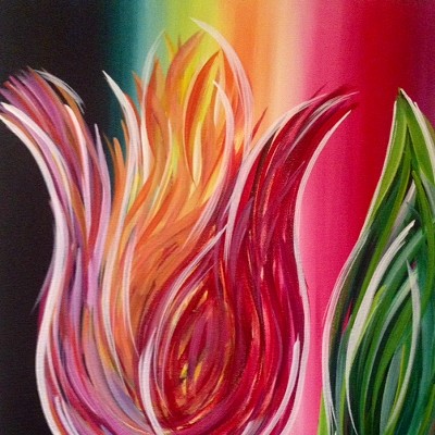
And if that old TV title conjures up the retro, so do these painters. Pamela Marks and David Pennington revel in pure painting, a predilection that's downright old-fashioned in this age of mixed-media, found-object, slash-and-burn anti-painting. In case we forgot, Marks and Pennington remind us once again what's so great about color layered on color, about a brushstroke traveling across a flat surface, about pigment piled into gullies and ridges, or pooling in thin glazes.
Both painters have made disciplined studies of color. Connecticut-based Marks has made a single hue the dominant player in each of her large acrylics on canvas, which come with such matter-of-fact titles as "Ochre #1," "Blue #2" and "Pepto" (for pink). But she's deployed these colors into fantastical compositions that wriggle and slither with life. From a distance, Marks' globes and ovals and squiggly tubes conjure up fevered jungles laden with fruit, or even, in an art historical nod, lush Renaissance gardens. But up close her organic shapes coalesce into organisms much closer to life's origins: cells and nuclei and DNA strands. Her teeming life forms are what a scientist might glimpse through the most powerful of microscopes; the paintings are what that scientist, if she were artistically inclined, might create by blowing up her Petri dish colonies into enormous color kaleidoscopes.
What's ironic about Marks' careening visions is that they're carefully composed and wild at the same time. Her shapes spiral exuberantly across the three-dimensional space she's created, a Pollock-like thicket of lines and spirals that seem to recede into infinity. Her globes and pears appear headed for cacophonous birth, through the black vortexes in the middle ground, and into the light in the background. And yet this fertile chaos is meticulously planned, with each painted sphere and squiggle duly occupying its designated niche. The movement has been captured, and stilled, like a butterfly pinned to a board.
Likewise, Marks varies her handling of the paint, alternating between thick and thin. In "Ochre #1," for instance, the bulbous ochre orbs are carefully modeled, with luscious paint and shadows conveying depth and three-dimensionality. But these catapulting ochres share the space with gray-greens as flatly painted as the gallery walls. A suite of watercolors delicately follows the same theme, with the circles and ovals layered transparently atop each other.
Once in a while, Marks' undulating orbs get a little creepy. I once knew a painter who made similar runaway shapes, only to discover that escaped endometriosis cells were rampaging through her abdomen. "Malady," one of Mark's larger canvases, makes you think of the downside of rampant organic growth--of fungus overpowering potatoes, say, or vermin reproducing recklessly, or cancer cells running amok. The large shapes, blue-gray in this painting, are subdividing like mad, seemingly intent on taking over the painterly terrain of red spirals and grapefruit-like yellow spheres.
PENNINGTON'S PAINTINGS, on the opposite walls, are devoid of all this organic drama. At first glance, his disciplined triptychs and diptychs on constructed wood boxes suggest a simple cerebral exercise. The numbered works are divided into two or three parts apiece, with each section undertaking some painterly variant, in color, texture and method of application.
"#201," for instance, has a heavenly blue on the right panel, acrylic painted in bold, visible strokes. There's a delicious, unfinished roughness to the panel: The blue doesn't reach to its edges, so we can see the fine contrast between passages of paint and not-paint. Its companion panel couldn't be more different. Purple paint has been sparingly applied in lines, perhaps by a fork, and then removed to allow the fleshy under-painting to shine through. The purple paint pooled in the tiny holes of the perforated board adds texture.
Pennington, a Tucson painter, is armed with a whole array of techniques. Sometimes his panels look like the oil-and-water designs on book endpapers ("#301"), sometimes they have shadowy horizontal stripes across the holes ("#602"), and in at least one painting, vertical cerulean swathes seem to be holding back a whole shadow world of deep blues beyond the surface (#702").
But these bare-bones descriptions of technique don't begin to convey the joy Pennington takes in his colors. When you look at his array of 12 multi-toned panels lining the walls, orange giving way to cerulean, giving way to yellow, green and rich earth red, you can't help but think of a kid gleefully upending his box of crayons (perhaps in front of the TV set). Pennington's been painting for a while, but he's still delighted to see that colors next to colors change each other, that layers create sensual 3-D sensations, that painting is an exercise in thrilling discovery. Old Walt would have been pleased.